Provident Bank
Website Redesign
The Homepage
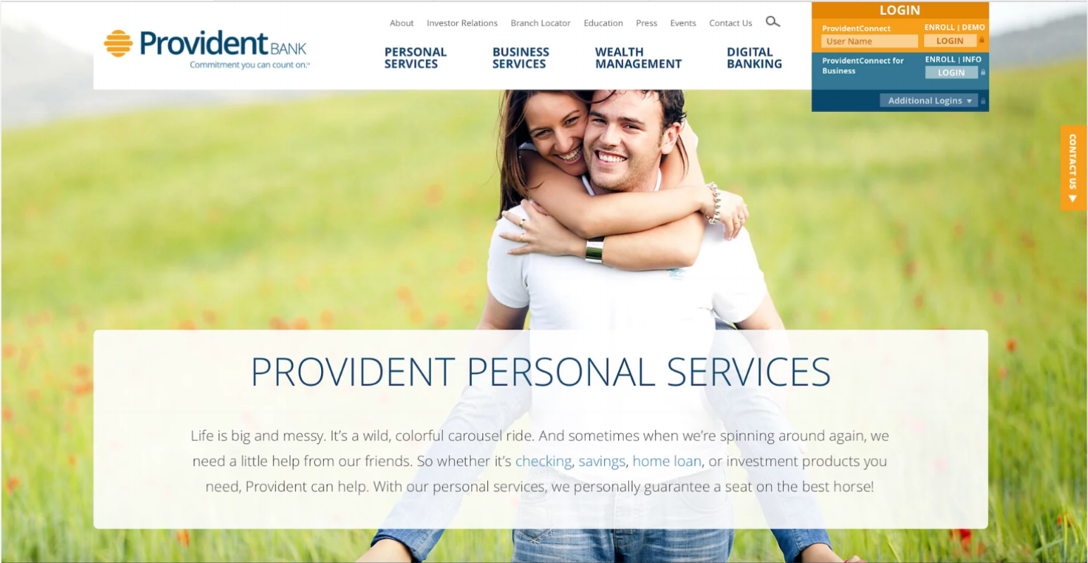
As the digital face of the brand, Provident’s website is crucial to the customer experience. Warm, friendly, and inviting, the homepage needs to draw in the user and quickly and easily direct them to what they’re looking for. It is the hub, the hearth, the heart. We knew if we got the homepage right, everything else would fall into place. And ultimately, we struck it just right.
I pushed the designers to make the imagery bold and beautiful — and wrote copy to match. I knew a bank website is not normally a place where people want to hang out online, but I aimed for digital “water cooler” just in case. À la Seth Godin, I instinctively understood that my job at Provident was not just to write copy, but to be a disrupter and ruckus-maker, an agent of change that connected people, lit them up, and ushered in the future.
Life Stages
The Life Stages sections are an innovative feature that connect the bank’s somewhat abstract products with people’s real life problems. They prove that Provident is not just an indifferent institution that offers one-off services, but an organization that’s part of their lives, at every stage. Visitors select their current life stage and are presented with the most relevant products and services.
View content: https://www.provident.bank/personal-services
View content: https://www.provident.bank/business-planning
Education & Insights
I encouraged our website vendor to make the Education and Insights Section feel more like a blog. Blogs invite readership and conversation; they create community. We divided it into four categories — Personal, Business, Investment, and Community — and I wrote informative, engaging, and compelling articles for those categories that were also shared on our social media properties.
READ FULL BLOG POST: https://www.provident.bank/education-insights/business/v-day_brand-story


